7 Iconic logos and their hidden symbolism
We see them every day— on the TV, in our homes and out in the street. They’re the famous logos of the brands we’ve come to know and love. But there's more to brand design than what meets the eye. Things aren't always what they seem at first glance, and these logos prove it.
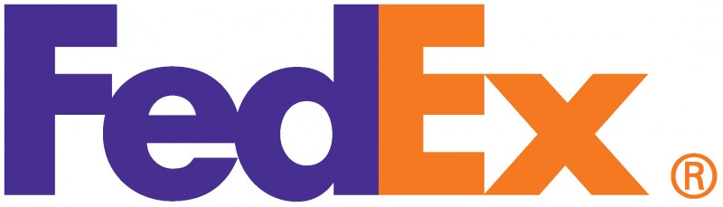
#1 FedEx
Take a look between the E and the X, where the negative space forms an arrow. The arrow which is situated between the letters E and X signifies the forward thinking and progressive attitude of the company.
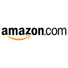
#2 Amazon
Ever wondered what the arrow in the logo stands for? Not only does the arrow underneath represent a smile, that their presumably happy customers will feel after their service, but it also points from A to Z to show that if there's anything you need, you can buy it on Amazon.
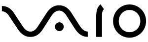
 #3 Sony Vaio
The Vaio logo combines imagery from both analog and digital electronics into one single element. The “VA” portion is in the shape of an analog waveform, while the “IO” represents the numbers one and zero, which are used in binary code. Combined, the letters not only spell out Vaio, but also represent the evolution of technology from analog to digital.
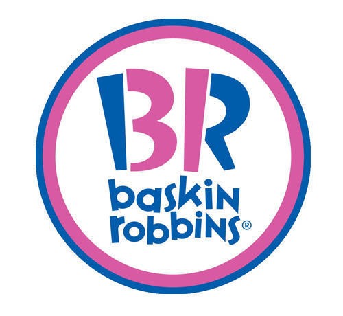
#4 Baskin-Robbins
The Baskin-Robbins logo may look like a simple BR above the name but on a closer look, you will see that it incorporates the number 31 in pink. Baskin-Robbins, owned by Dunkin' Brands, is one of the world's largest chain of ice cream shops, best known for its 31 flavors.
#5 Sun Microsystems
Usually tech companies stick with boring, meaningless logos but not the Sun Microsystems. This logo is a wonderful example of symmetry and order. It is a brilliant ambigram where the company name can be read from every direction.

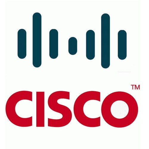
#6 Cisco
Cisco Systems primarily revolves around telecommunication, so it makes total sense to choose a symbol that represents electromagnets. However, what many people don’t notice is that the electromagnetic waves signify the Golden Gate Bridge. The company has its origin in San Francisco, so the Golden Gate Bridge shape is a homage to the company’s roots. The name “Cisco” itself is a nameplay on the word “San Francisco”.
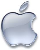
#7 Apple
The Apple logo is derived from the story of Adam and Eve in the Bible and the bitten apple represents the fruit from the “Tree of Knowledge”.
#8 Facebook Places
If you didn't know Facebook Places already, it's Facebook's new geolocation product, which is in direct competition with Foursquare. Now if you take a closer took at the logo, you will see that it points to a four inscribed in a square. Now, is this a mere coincidence or a dig at Foursquare?

Comments